Meals on Wheels America Conference
Each year, leaders from Meals on Wheels programs across the country and experts in the field gather at the Meals on Wheels Annual Conference to further their thinking, share new skills, offer new perspectives and draw up plans for a positive future. The 2016 Conference featured the theme Together We Rise – speaking directly to the urgent need for the national network to come together in a single movement, with a single voice, to tackle the challenges and seize the opportunities ahead.
Silver winner of the Association Trends' 2017 All Media Contest for best Convention Program.
We’ve been very happy with our results. Copper Note listens to our needs and won’t rest until they’re met. If you’re looking for a talented and attentive design team that is a pleasure to work with, look no further.
Jenny Bertolette
Vice President, Communications
Meals on Wheels America
Branding
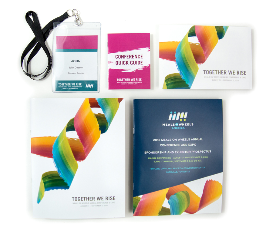
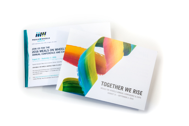
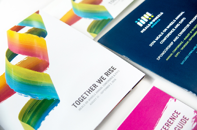
We worked alongside the Meals on Wheels America Communications and Marketing team to bring this event branding to life. The upward, twisting movement of the colorful paint strokes illustrates a diverse network, that, when working together becomes a beautiful, harmonious and tightly-knit machine. These elements were carried throughout all Conference materials and microsite, including the Convention Program and supplemental Quick Guide, to bring movement and energy to the traditionally information- and text-heavy elements.


A unique twist
The paint strips in the theme imagery were created by hand, not in a 3D program. Paint colors were first brushed and blended onto acetate film, then cut out and sculpted together while hung from a bar with clear nylon string. This delicate hanging composition was then photographed to create a customized, energetic effect.
Created in coordination with the Meals on Wheels America's colorful new national Ad Council campaign, this conference design complemented the association’s branding and yet provided distinct event visuals.


Online brand

Designing inside and outside the box
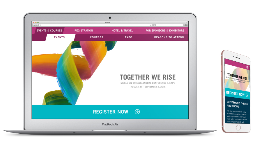
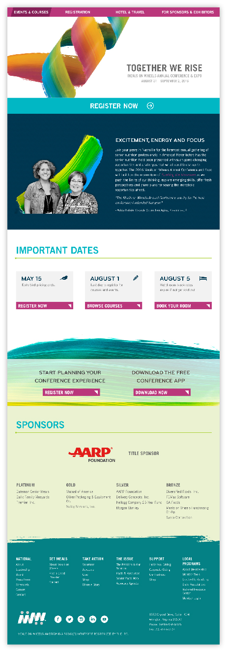
To streamline the implementation of the online brand of the conference, we designed the site to work within the existing template of the main website. While using the base structure, we were able to reduce development costs while still bringing the brand online effectively. Design elements were systematically and strategically created to work in tandem with clear communication and a strong hierarchy of messages.


Day of materials
Full program
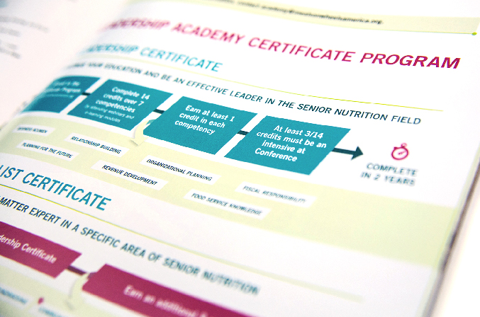
The program contained the agenda, event information and course descriptions, organized in an intuitive and easy-to-read format throughout. Complex floor plans were color-coded and displayed in a way that helped them to jump off the page. Sponsor and exhibitor ads were printed in color and neatly organized in the rear of the program to prevent cluttering or separating the main content. Print management services were provided so that everything arrived on time, was easy to use or assemble, and the color profile matched across the board.



Quick guide
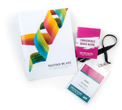
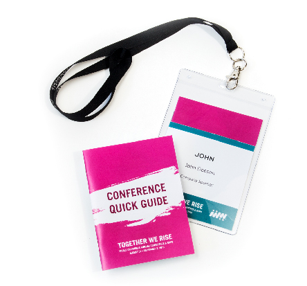
For the first time this year, we included a well received and often referenced Quick Guide. It contained critical information including event and course locations, floor maps, wifi passwords and a list of exhibitors that attendees could tuck into their name badges for easy access.

Conference Program from Lindsay Garrett on Vimeo.


